- Home
- Mixing Colors
how to mix colors: everything you need to know
An understanding of how to mix colors
brings joy and excitement to the art of painting.
Artists don't have to get all our paint colors from the store. We can create an expansive range of hues and shades that are often unavailable in store-bought paints.
We have the power in our hands to make the perfect color mixtures for our artwork. Explore the joy of mixing colors.
How to mix / Color harmony / Colors we don't buy / Top tips / Using color in our paintings
the artists' favorite color mixing tool
The color wheel is indispensable when we are learning how to mix colors.
We use it to see the relationship between different colors and predict the result of our mixing.
 Mix colors with the primaries.
The primary colors
Yellow, red and blue are equally spaced on the color wheel. These are the primary colors.
They cannot be mixed from any other colors.
However, the primaries
are the foundation of all other colors. We mix our colors using the three primary colors.
Where did the color wheel come from?
color terms of color mixing
Understanding color terminology is a key in learning how to mix colors. The main terms include hue, shades, tones, tints, saturation and values.
what are hues, shades, tones and tints?
We know the color names such as red and green, etc. What else do we need to know about color?
Hue is the name of the actual color. For example, apple red or fire engine red are both red hues. Olive green is a green hue.
Shade is created by mixing any hue with black. A shade is darker and duller than the original color.
Tones are made by mixing a color with grey.
Tints are made by mixing a color with white. However, adding white to a color will give it a chalky appearance.
Saturation is the color's purity or intensity.
Value is the light or darkness of a color.
Mastering these aspects will lead to more refined and satisfying color mixing.
This video shows painting the color adjustments

how to mix colors
What colors do artists use for mixing? We will use a limited palette to master color mixing.
- Cadmium Yellow
- Cadmium Red
- Ultramarine Blue
A double primary palette, also called a split primary palette is a warm and cool version of each primary color.
practice mixing the secondary colors
 How to mix the secondary colors
It's fun mixing colors and you will be surprised how easy it is.
Get your paint colors out and start mixing colors.
Two primary colors mixed together create the secondaries: orange, green and violet.
Mix each secondary color:
- Red and yellow make orange.
- Blue and yellow make green.
- Red and blue make violet (purple).
Orange, green and violet colors are so easy to mix, so we don't have to buy them.
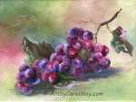
how do we mix more green colors?
Nature provides a wide variety of greens. It's easy to mix variations of green.
 Mixing green colors
Thalo Blue is a very strong blue that is not on our practice list. However, it makes the most beautiful greens.
Use just a touch of Thalo Blue with yellow to mix a green. See tip #3
Now we can mix more greens:
- Starting with the mixed green, add more yellow to get a nice spring green.
- Add more blue to your original green for a cool blue-green.
- The addition of red to the original green will produce a darker, more subdued green.
We can mix additional greens with other blues and yellows. Ultramarine Blue and yellow make quieter natural looking greens.
tertiary colors: expand our mixing possibilities
 How to mix the tertiary colors.
Tertiary colors are created by mixing a primary color with a secondary color.
Refer to the color wheel and practice mixing tertiary colors.
We have the secondary colors we just mixed on our palette.
Now, mix our palette orange with primary yellow to create the tertiary color yellow-orange, as noted in the YO example.
Mix the other tertiary colors clock-wise around the color wheel: yellow-green, blue-green, blue-violet, red-violet and red-orange.
Now, we don't have to buy any tertiary colors because we know how to mix them.
how do artists create color harmony?
Color harmony is an essential art principle that brings balance and appeal to our artwork.
The different elements of a harmonious painting work together seamlessly. Rather than clashing or competing with each other, they are pleasing to view
Using color schemes like complementary, analogous or monochromatic schemes can lead to beautiful, harmonious results.
creating color harmony
We create harmony in our paintings by using only two - four selected colors in each painting. All the tertiary, complimentary, neutral, dark and grey colors are mixed from the original two - four colors.
The painting automatically displays color harmony because any additional colors are mixed from our selected 2-4 colors.
We do not add other colors to the painting, except what we mix. That maintains the harmony of colors.
colors we never need to purchase
We can mix the majority of our colors, so we only have to keep a few colors in stock.
how do we mix dark, neutral colors?
Mixing maintains perfect color harmony in our paintings. We mix the neutral colors from the colors we are already using in the painting.
We can mix black, brown or grey by combining the three primary colors. There are two different ways to do that.
- Mix equal parts of the three primary colors.
- Mix one part of a primary color with two parts of its complimentary color. That also is actually mixing the three primaries together.
simple, quick dark mixtures
 Mix our dark colors
Viridian Green and Alizarin Crimson mixed together create black.
Adding additional Viridian or Alizarin will slant the black toward green or red.
Burnt Sienna and Ultramarine Blue are a very useful mixture.
Add more Ultramarine to make a cool black.
Use more Burnt Sienna for a nice warm brown.
How to mix grey colors
We don’t buy tubes of grey paint because it's so easy when we know how to mix colors.
Mixing white with any of our dark, neutral colors will create various tints of grey.
top tips for practical color mixing
- Single pigment paints produce clean, clear
colors. Look on the paint tube and make sure the color is manufactured with only
one color pigment. Most companies list the ingredients on the tube. If they are not on the tube, check their website.
- Mix paint colors with a palette knife, instead of a brush. It uses less paint.
- When you are learning how to mix colors, always add the
dark color to the lighter color. It only takes a tiny bit of a dark to change a light color.
- Rather than using white to lighten a color, add the lighter color next to it from the color wheel. The color
will remain bright without a chalky appearance. White is a cool, opaque color.
For example: Mixing white with orange, will cool the orange and make it look chalky. Instead, we add yellow to lighten orange. The new orange will be bright and lively. - Don't mix paint colors thoroughly before
putting them on a painting. The color variation adds more interest to
our paintings.
- When we start a painting, mix a large pile of a
dark, neutral color from the painting's colors. While
painting, we can add white to the dark color to make various tints of
grey.
Then we may use the greys or the original dark color to subdue any of the other colors in the painting. This maintains color harmony because all the colors are related. Plus, we won't have to keep mixing our greys and darks again throughout the painting process. - Clean the brush before mixing a new color. Any paint left in the brush could alter the new color we are mixing.
how do we use color in our paintings?
A guide to using warm and cool colors in paintings.
Colors may be considered warm or cool.
 Warm and Cool Colors
warm colors
Warm colors contain yellow and convey energy. They are known to "advance" toward us, so they make areas look closer.
Use warm colors in the foreground and middle area of a painting.
How do we mix warm paint colors?
We can make any color warmer by adding yellow or orange which contains yellow.
For example, if we are painting an orange, the center of the orange is bulging toward us. Paint the center warmer to make it advance toward the viewer.
The sides of the orange would be painted cooler to make them turn away from us.
cool colors
Cool blue colors can feel tranquil or unhappy. They recede into the painting and look farther away.
We can create distance in landscape paintings by mixing some blue into the background areas.
We mix cool colors by combining a color with blue or green or purple which contain blue.
For example, make the edge of an object turn away from us by adding cool colors to the edge. We may also, use cool colors to set one object behind another.
Learning to how mix colors is one of the joys being of an artist!
How to mix colors that look more natural
 The compliment of red is green.
Sometimes we want calmer, natural looking colors in our paintings.
Mixing any color with its compliment will subdue it and make it look more natural.
Complimentary colors are directly across from each other on the color wheel.
There are two ways to subdue a color and make it a more natural looking color.
- Mix a color with its complimentary color.
-
Mix the color with a black, brown or grey that we have mixed from the colors used in the painting.
Bright, bold colors are lots of fun, but natural looking colors are beautiful, too.
the joy of mixing colors
The art of how to mix colors is an essential skill for artists. By understanding the relationship between colors, you'll be able to predict the outcomes of your mixes and create a harmonious color palette.
Using the knowledge of hues, shades, tones and tints, you'll be able to adjust the colors to your desired effects.
Feel free to explore additional pages on the website to uncover more resources about painting art.
Get your paints out and explore the joy of mixing colors. The world is your canvas, brimming with possibilities.
Make your paintings sing with color!
more about using color
The Best Paint for Artists
How do we choose the best paint for artists? What artist paint colors should we use? Single pigment colors in a warm and cool version are an excellent choice.
Painting with a Limited Palette: Mastering Color Harmony & Creativity
Discover the art of painting with a limited palette. Tune in to color harmony & craft a fun, colorful, harmonious step-by-step painting with only four colors.
Meaning of Color: The Symbolic Significance of Color in Art
Empower your paintings with the right color choices. Learn the meaning of color, color symbolism and how color influences the viewers' emotions and perceptions.
Mix Skin Color for your portrait paintings
You can paint portraits when you know how to mix skin color. Make the skin colors and paint a child’s portrait with a step-by-step watercolor painting guide.


Recent Articles
-
Learning to Paint
Mar 29, 24 12:00 PM
 Learning to paint is fun! Millions of people are painting and you can too!
Use these five easy things to jump start your painting journey.
Learning to paint is fun! Millions of people are painting and you can too!
Use these five easy things to jump start your painting journey. -
Easy Butterfly Painting: Watercolor Monarch Step-by-Step Tutorial
Mar 25, 24 03:39 PM
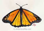 Get creative with an easy butterfly painting tutorial. Discover the joy of drawing and painting a vibrant Monarch Butterfly with simple watercolor techniques.
 -
Overcoming an Artist's Block
Mar 15, 24 12:00 PM
 How to survive an artist's block. All artists can have blocks or delays, but we get over it.
What is an art block? How do we get started painting again?
How to survive an artist's block. All artists can have blocks or delays, but we get over it.
What is an art block? How do we get started painting again? -
Bird Paintings
Mar 03, 24 09:11 AM
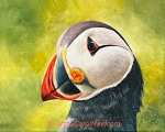 A captivating tribute to our feathered friends.
The amazing diversity and beauty of birds comes alive with watercolor and oil paintings of birds.
Get inspired to paint the birds you see or simply enjoy…
Recent Articles
-
Learning to Paint
Learning to paint is fun! Millions of people are painting and you can too!
Use these five easy things to jump start your painting journey. -
Easy Butterfly Painting: Watercolor Monarch Step-by-Step Tutorial
Get creative with an easy butterfly painting tutorial. Discover the joy of drawing and painting a vibrant Monarch Butterfly with simple watercolor techniques. -
Overcoming an Artist's Block
How to survive an artist's block. All artists can have blocks or delays, but we get over it.
What is an art block? How do we get started painting again? -
Bird Paintings
A captivating tribute to our feathered friends.
The amazing diversity and beauty of birds comes alive with watercolor and oil paintings of birds.
Get inspired to paint the birds you see or simply enjoy…